John W. Sheldon
Multi-disciplinary Designer
User Experience
John W. Sheldon designs experiences and interfaces that enable the user.
Work Samples
User Experience · Layout · Video Production · Illustration · Branding · Photography
The User Experience Process
User experience design is about far more than interface design. The design of any product or service from conception to delivery should be a continuous process of UX design, in which the design is constantly tested by potential users, improved, and evaluated according to its purpose. John practices User Experience Design for apps and services, and also as a designer of games and game play materials.
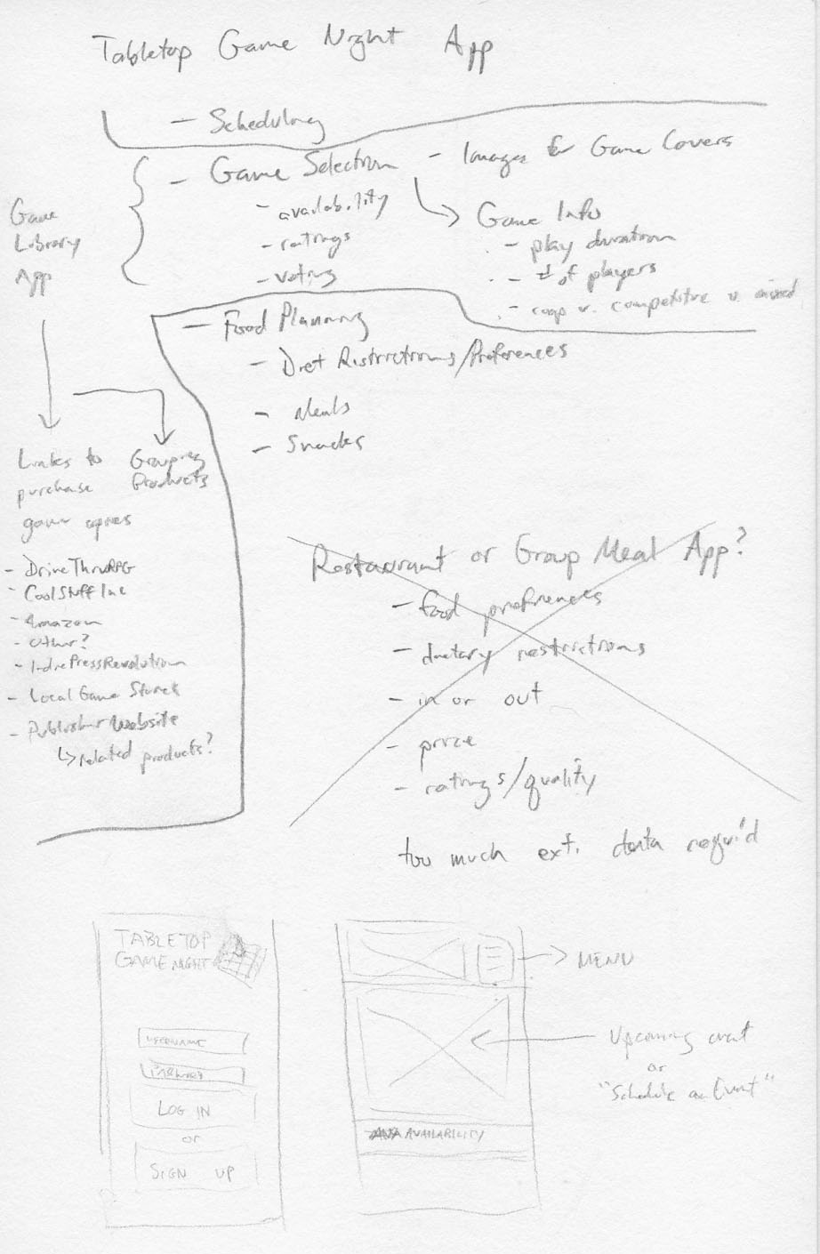
Tabletop Game Night App
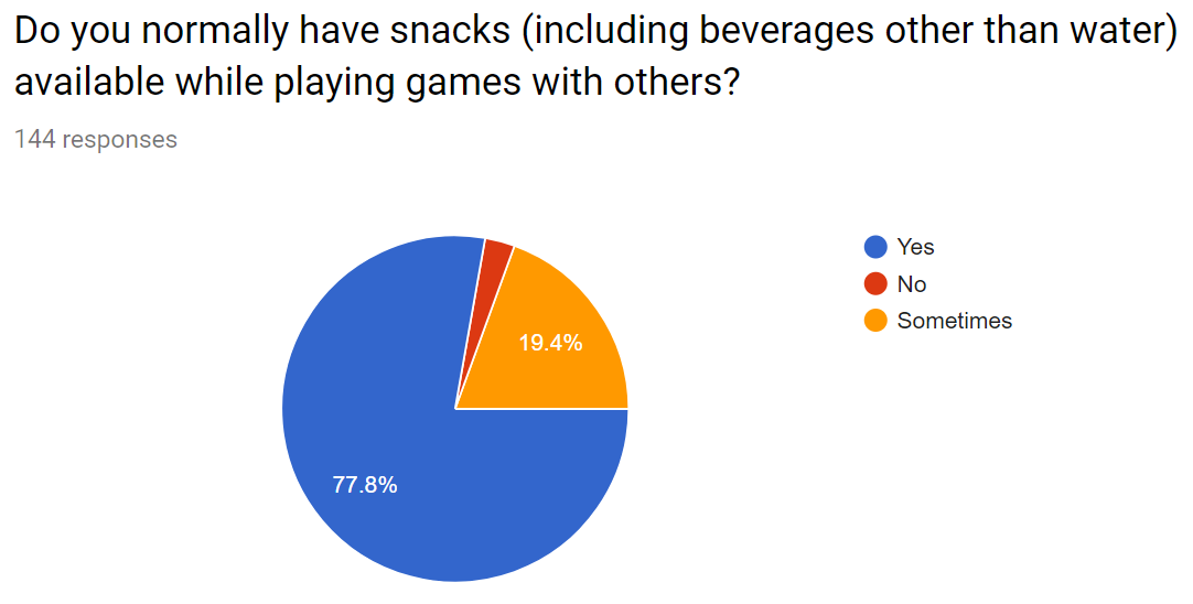
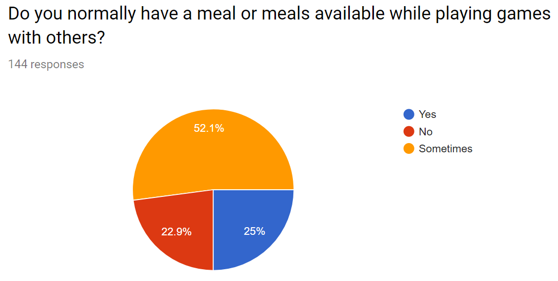
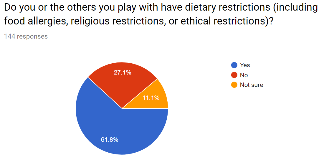
The Tabletop Game Night app is a scheduling app to help busy adults find common openings in their schedules and fill them with opportunities to get together and play games. Since many of these gatherings will involve snacks & communal meals, the app also helps people account for their friends dietary restrictions while planning. John created and tested this rough prototype as part of his Master's program at Duquesne University.
The Concept
John's inspiration for this application came from difficulties he noticed in trying to schedule events with extended friend groups. The app is named specifically about tabletop games, as many other kinds of activities and gatherings have predefined schedules (e.g., sports watching parties), or fewer scheduling difficulties (e.g., playing video games is often done online, and therefore more flexibly scheduled).
After some initial brainstorming, John interviewed two others who play tabletop games for additional input. With features derived from both brainstorming and interviews in mind, John posted a survey for potential users and sketched initial design ideas.
Brainstorming notes
Design concept sketches
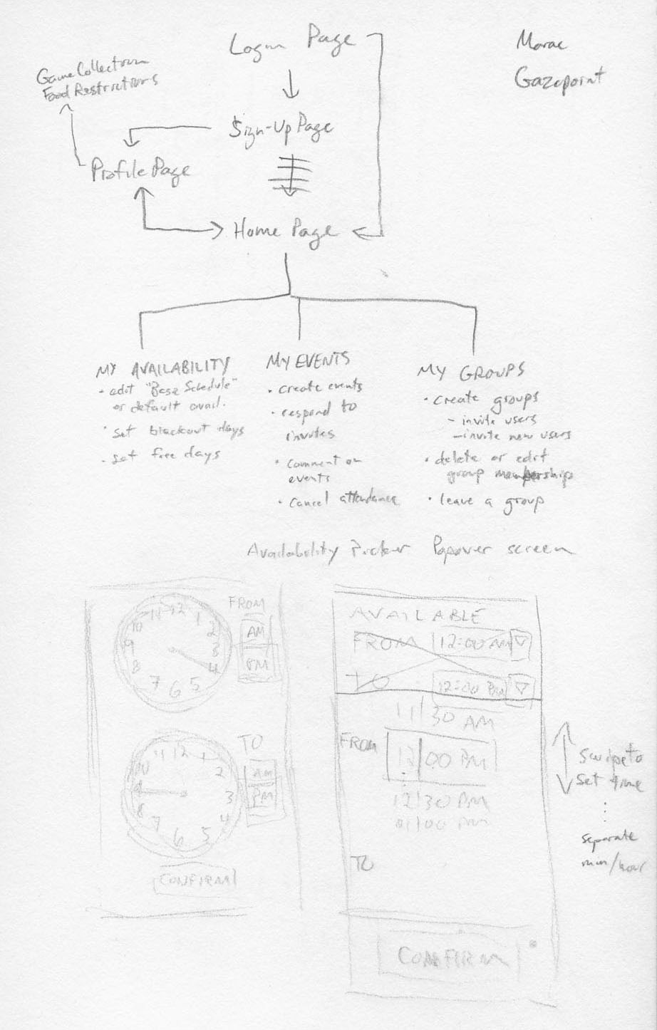
User process sketches
User Research
Using the survey results, John analyzed the problems faced by potential users, and the features the app will require to solve them. John also used the interviews and the survey responses to create a user profile and specific tasks that users will address in the app.
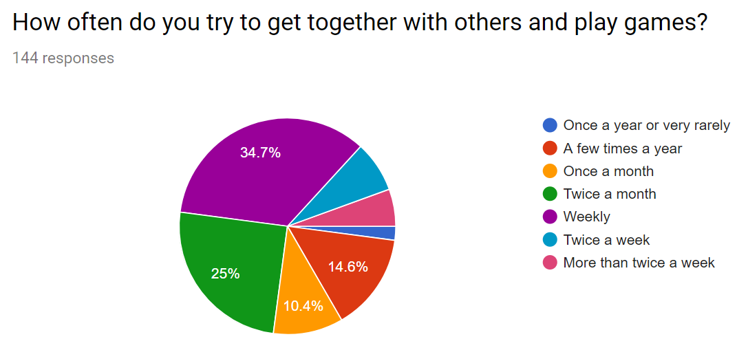
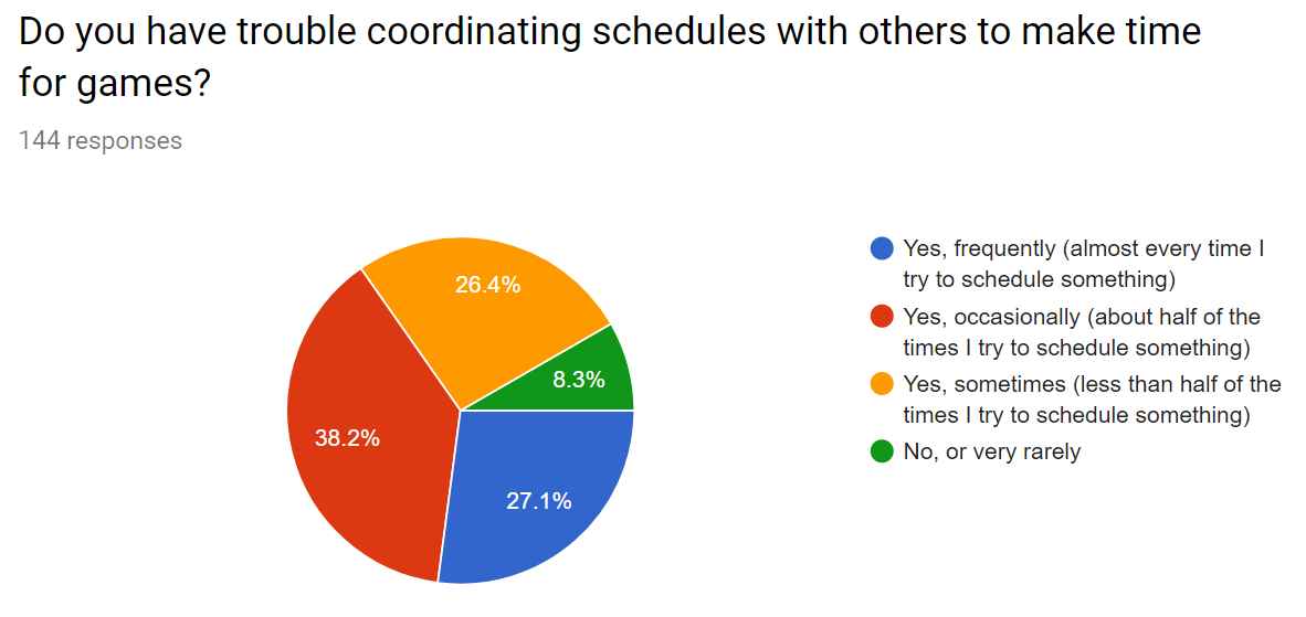
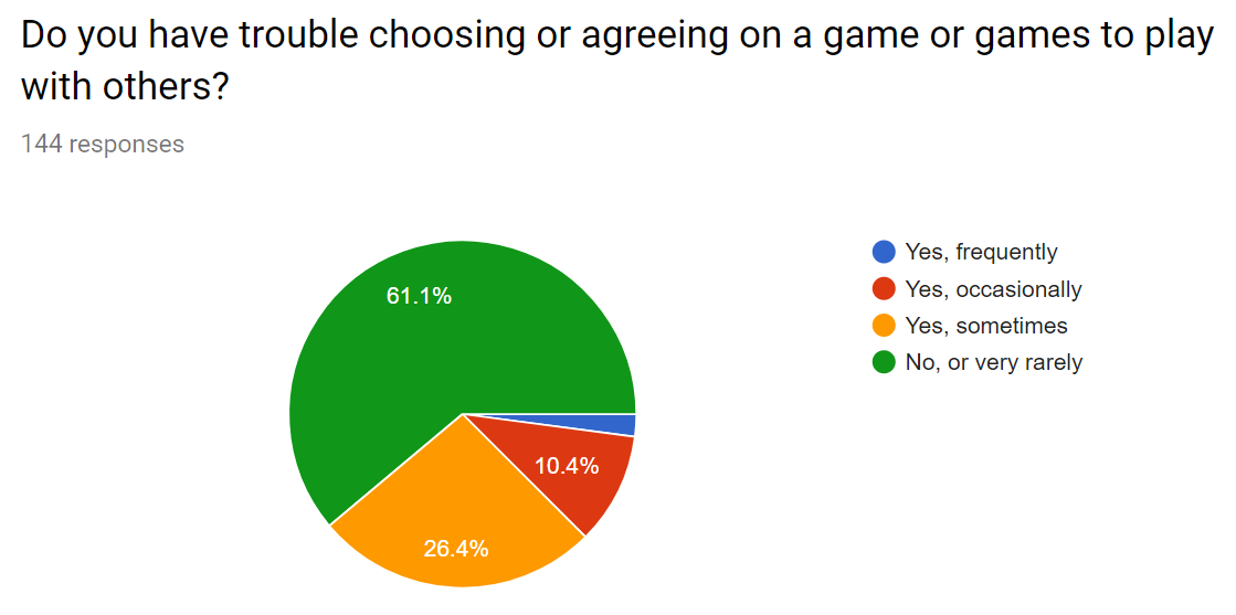
Full results of the online survey can be downloaded here.
John's analysis of the survey results, and the resulting user profiles, user goals, and tasks can be found in the Executive Summary. It also contains more in-depth problem analysis, and developed task flow diagrams and user experience maps.
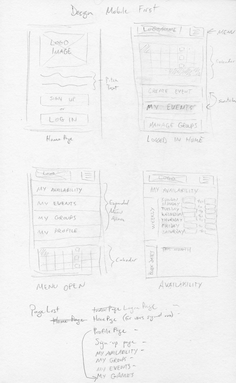
Use Case Scenario Designs
After consideration of the user tasks and use case scenarios, John sketched thumbnails of different app screens and interface elements.
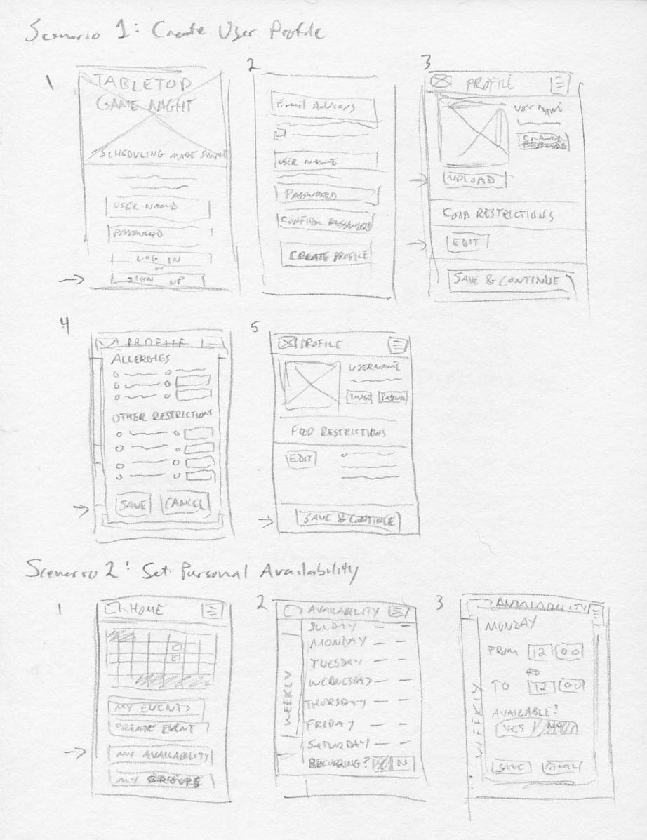
User Task 1 & 2 screen thumbnails
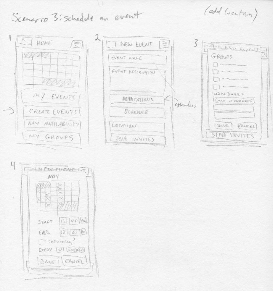
User Task 3 screen thumbnails
Wireframes and Prototypes
After getting feedback on the thumbnails from other designers, John created wireframes in Axure. These wireframes refined the app's page architecture and visual style. During this stage, John added functional elements to the wireframe to prepare it for conversion to a testable prototype.
After further feedback from other designers and potential users on the arrangement of the elements and menus in the Axure wireframe, John made refinements and replaced many of the placeholders with more attractive assets for testing.

Login page header image, CC-BY 4.0 John W. Sheldon
Sample user profile image
With the layout and graphic improvements incorporated into the wireframe, John then finished adding the functionality required for the test tasks.
You can see the initial testing prototype here in HTML.
User Testing Procedure
User testing was conducted in two groups: a group of users (3) from the Duquesne University, and a group of users (2) from outside. Each group saw a slightly different version of the prototype, due to differences in the versions of Axure available at each location (7.0 at home, 8.0 at the school). In both groups, John read a written introduction out loud to them, then provided a written list of tasks to be performed. The user interactions with the prototype were recorded via the Techsmith Morae software, which recorded the user via webcam while recording the screen and user inputs. When the user was satisfied that they had completed the tasks, recording was stopped and the user responded to an electronic survey about the interface they had just experienced. The users then filled out a short paper survey that allowed more open-ended responses.
You can view the test script, tasks, and paper survey here.
User Testing Results and Analysis
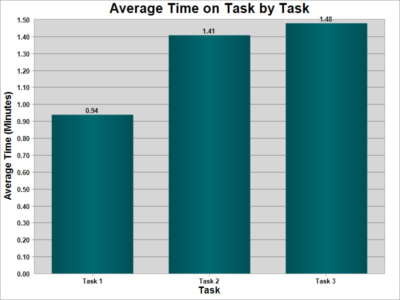
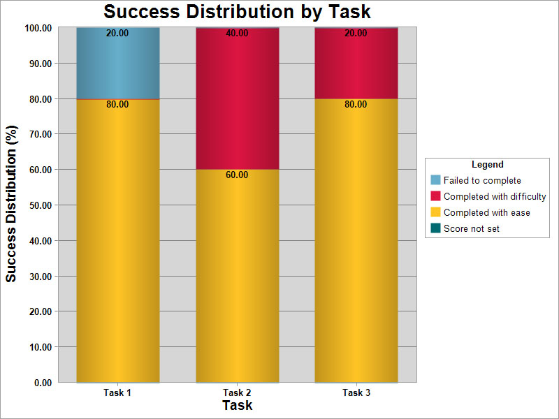
Users were able to complete the assigned tasks in the majority of cases. Most tasks were completed with little difficulty or confusion, and under 2 minutes average per task. Lack of appropriate feedback in one case led a user to believe they had correctly completed a task when they had not. Task test results are graphed below. Task 1 was signing up and creating an account, task 2 was setting their personal availability, and task 3 was creating a new event.
Results of the electronic survey can be downloaded here, and the completed paper surveys can be viewed here. A majority of users rated the interface as being easy or very easy to use and learn. In all avenues of feedback (verbal during the testing, survey responses after testing, verbal after testing), users indicated they didn't feel that they had enough feedback from the application. They wanted positive confirmation of their changes and entries on each screen of the app.
Several users noticed that in the testing prototype the home page calendar and the other calendars presented in the app are cosmetic in nature and do not respond to user interactions or updates. John did this to limit the amount of programming involved in the prototype, but it led to user difficulties as they attempted to interact with those elements and looked to them for feedback. Some users also commented that they prefer to stay "on the page" when enterering information rather than having a hovering tile or window appear. It is important to note that the testing was conducted via desktop simulation rather than on an actual mobile phone, so the limits of touch accuracy and on-screen keyboards did not present themselves as testable issues.
In all 5 tests, users attempted to enter information into the login area of the login page before noticing the 'sign up' button. The single task fail occured because the prototype's login button allowed the user to proceed to the home page after entering information into those fields rather than requiring them to work through the sign up screen. Design refinements are obviously required to help users notice the "sign up" button more quickly, and updates to the prototype must include correct login functionality.
User feedback on color, font, and image selection was generally positive. Three of the five participants chose to select a user profile image during the profile creation task, and all 3 selected the cat image with positive comments. Two users also commented positively about the image of the dice on the login page, and the logo design. No users had specific, negative feedback about image, font, or color selection.
Feedback-Based Improvements and Future Testing
Multiple changes are required to help resolve the issues observed during testing and mentioned in the user feedback. The calendar must be made responsive on every page where it appears. At a minimum, it must display the user's noted available days and the scheduled events. Additionally, the time selection system on the availability page and the scheduling page must change from the dropdown list selector to a more mobile-friendly swipe selector (as was originally intended, but not feasible given the the functional constraints of using Axure for prototyping).
Users must also see positive indication on the availability page that a given day has been marked 'available' or 'unavailable' in addition to displaying the selected time. Seeing the availability and events noted on future screens' calendar displays should satisfy user requests for additional feedback, but it will require additional testing to confirm. Finally, the navigation menu button (the 'hamburger' button) should open (and subsequently close) an on-screen menu for navigation rather than taking the user back to their home page.
In addition to the above-mentioned upgrades to the calendar display and time selectors, the login page requires updates to the order and color of elements to help new users find the correct "sign up" area quickly and easily. Other changes include the addition of a legend below the calendar to help users interpret the marks on the small date tiles and read their availability and events at a glance, and more widespread and consistent use of the red, green and blue colors. Finally, users need a way to see when they've been invited to events or groups through the app, and the example images below show how that might be done. As with the other improvements, this will require testing to confirm whether it is effective.
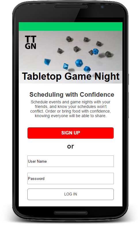
Prototype Login Screen
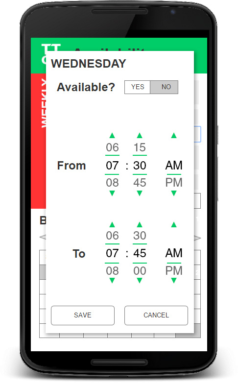
Prototype Set Availability
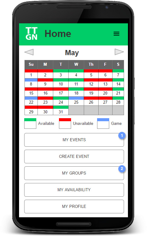
Prototype Home Screen